Posted on Leave a comment

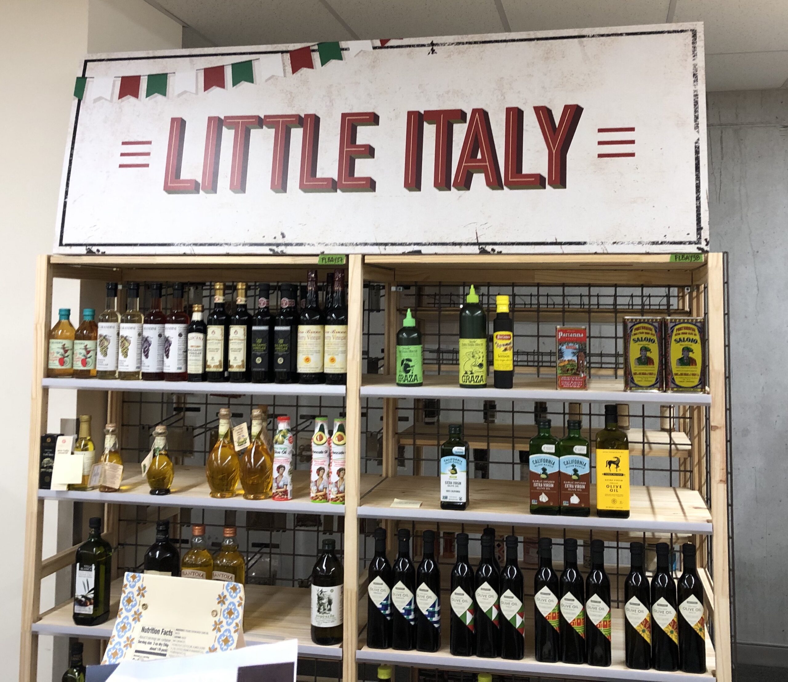
Creating Consistency: Designing the same display for different fixtures (World Market: Little Italy tent)

World Market

In the world of retail, establishing a seamless and engaging shopping environment is of utmost importance. Designing E-flute displays for a variety of fixtures while ensuring consistency across differing materials, shapes, and sizes presents a significant challenge. This article explores the captivating journey of creating a unified E-flute display for diverse fixtures, focusing on a real-world case study set within World Market’s charming Little Italy tent.

The Significance of Consistency in Retail Design

Consistency in retail design transcends merely keeping things visually aligned; it is about forging a seamless and memorable customer experience. A shopper’s journey through a store should be marked by a consistent, cohesive design language that reflects the brand’s ethos, resonates with its target audience, and ultimately fosters loyalty and trust.


The Challenge: Achieving Consistency Across Diverse Fixtures

Crafting an E flute display that adheres to brand standards across an array of fixtures such as tables, shelves, and wall units can be a formidable task. These fixtures come in varying shapes, sizes, and materials, necessitating innovative design solutions to ensure the desired unity.

World Market’s Little Italy tent is a striking example of this challenge. The tent houses an eclectic assortment of fixtures, including wooden tables, metal shelves, and wire racks. The goal here is to create an E-flute display that seamlessly blends with these distinct fixtures while preserving the brand’s unique Italian charm.


Design Principles for Uniformity

  1. Material Selection: The choice of materials is a critical first step. E-flute cardboard was selected for its combination of strength, flexibility, and eco-friendliness. This choice ensures that the displays harmonize with the rustic and natural essence of the fixtures.
  2. Color Palette: Establishing a consistent color palette is vital. In the case of the Little Italy tent, we opted for warm, earthy tones, reminiscent of the Italian countryside. This palette not only complements the diverse fixtures but also aligns with the brand’s identity.
  3. Modular Design: To accommodate different fixture dimensions, a modular design approach is essential. For this project, components were crafted to be easily adjustable to fit various table sizes, shelf lengths, and wall spaces, ensuring uniformity across all displays.
  4. Branding Integration: Consistency demands the seamless integration of branding elements. The E-flute displays for World Market’s Little Italy tent featured the company’s logo, fonts, and style elements to ensure a unified brand experience.


The Implementation Process

Implementing a consistent E flute display design across various fixtures demands effective collaboration and adaptability. It necessitates close cooperation among fixture manufacturers, designers, and store personnel to translate the vision into reality.

In the case of World Market, our team engaged in an iterative process of prototyping and refining the E-flute displays to ensure a perfect fit on different fixtures. Detailed guidelines for store staff on installation and maintenance were provided to ensure the desired consistency throughout the shopping space.


The Outcomes: A Seamless Shopping Experience

The successful realization of a consistent E-flute display for the Little Italy tent at World Market has yielded exceptional results. Shoppers wandering through the tent are now greeted with a unified blend of Italian charm and the brand’s identity, regardless of the fixture they encounter. This cohesiveness resonates with customers, instilling trust, and inspiring them to explore and make purchases.


Conclusion

Designing a uniform E-flute display for diverse fixtures is a blend of art and science. It involves understanding the brand’s essence, the versatility of fixtures, and the power of materials and design principles. When executed effectively, as exemplified by the Little Italy tent at World Market, the results can transform a retail space into an inviting and memorable shopping experience. In a world where consistency is key, the right design choices can make all the difference.


Jeff Lo is owner and president of TGS Elevate, a certified Minority Owned Company (MBE) that does the work of seven separate vendors – encompassing 2D and 3D design, printing, fabrication, project management, logistics and sourcing – to save clients time and money. TGSE’s minority ownership in printers and fabricators across the country allows control of lead time and pricing. This lower overhead cost gives us the flexibility to find the right production facility and supply chain for your project and gives you one point of contact, from design to installation. 


Jeff Lo is owner of TGS Elevate, a visual marketing / merchandising company that provides printing, point of purchase displays, and store fixture manufacturing, and in-store build outs for companies that have 50-500 locations nationwide.

Want to chat?


Get help from one of our professionals

Posted on Leave a comment

Franchise Fund (Golden State Warriors)

Franchise Fund

We’re excited to announce that Jeff Lo, president and owner of TGS Elevate, has been selected by the Golden State Warriors and United Airlines to join the 2023-24 cohort of the Franchise Fund!

Starting in 2021 in partnership with the The Golden State Warriors, United Airlines, and the Western Regional Minority Supplier Development Council (WRMSC), the Franchise Fund program was created to prepare small and medium sized businesses in the California Bay Area to do business with large corporations. 

The multi-month program includes a grant and scholarship for 25 business, culminating with a graduation at Chase Center in the spring of 2024

Franchise Fund


Jeff Lo is owner and president of TGS Elevate, a certified Minority Owned Company (MBE) that does the work of seven separate vendors – encompassing 2D and 3D design, printing, fabrication, project management, logistics and sourcing – to save clients time and money. TGSE’s minority ownership in printers and fabricators across the country allows control of lead time and pricing. This lower overhead cost gives us the flexibility to find the right production facility and supply chain for your project and gives you one point of contact, from design to installation. 


Jeff Lo is owner of TGS Elevate, a visual marketing / merchandising company that provides printing, point of purchase displays, and store fixture manufacturing, and in-store build outs for companies that have 50-500 locations nationwide.

Want to chat?


Get help from one of our professionals

Posted on Leave a comment

How to Design and Develop a Retail Space

Design and Develop

Designing a new retail space can be daunting. Many decisions made early on guide what is ultimately created in stores in the form of graphics and fixtures. Be aware of these early on in the process, or better yet, enlist professional support with a designer, architect or fabricator as you’re going through the process to ensure your final execution will hit your in-store experience and sales goals.

In this article, we’ll explore high level key elements in creating a retail space starting from scratch, describe the role of retail fixtures, and provide actionable take backs you can use immediately, regardless of where you are in the process.


Clear Brand Identity

Visual communication. This industry term describes the use of visual elements (graphics, fixtures, etc.) to convey a message. To be able to clearly communicate that message, you have to be crystal clear on what the message is. If you’re not clear on the what, the how (through design, graphics and fixtures) is going to be even less clear.

Avoid potential confusion or cognitive dissonance by starting with the brand. What’s at the heart of why the company does what it does? How is it communicated (core values, mission statement, colors, environmentally sustainable) in other channels (website, press releases)? What price point are you selling to (value, middle of the road, or upscale)?

Action items:

  • Know company core values
  • If you could pick only one thing – what should the brand be known for?
  • What price point are you selling to (good, better, or best)?


Know your customer

Clearly define who your customer is. Think about your best customer – what do they look like, what values are important to them personally, how frequently do they shop, how do they like to be interacted with (or not!) while they engage in your space? You’re their guide, and they’re the hero in the story of their shopping experience. What are their barriers, potential pitfalls, or if they don’t choose the right product to buy?

Next, hone in your messaging to speak to this customer. Be specific, give them a name, a life, a social structure, and be direct. Have fun with the process, sprinkle in items that are unique to the brand to build a lasting relationship with them that make your products and services irresistible. 

Action items:

  • Clearly define your customer
  • Refine your messaging to connect brand to customer
  • Understand the customer journey while in your space


Know your competition

Identify other brands or retailers that compete in your space. Use tools like LinkedIn’s Sales Navigator to select for geography, industry, size, etc. Then, go out and visit their stores. Take pictures, assemble a list of must haves and nice to haves that fit your company.

Take your partner with you, go separately and share notes after. Ask yourselves if things make sense, and point out changes you’d make for your store. Are there better ways you can connect your company and customers together than the competition? Identify those areas and make them clear messaging points for the future.

Action items:

  • Identify competitors
  • Visit / audit competitors
  • Question and revise your brand and messaging


Know the space

Interesting that this is the fourth step in the process, isn’t it? To us, starting with the target and working backwards gives us the best chance of hitting it. If you start with the space first without knowing your brand, it’s a less direct path to success, a time and cost killer.

The space itself is also crucially important – of course. Who are your neighbors, what do they sell and to who? Where are you located relative to the traffic flow? Do you have a design committee or landlord that also needs to sign off on your store? Generally, how does your ideal customer interact and move through the space most effectively?

Now might also be a good time to engage professional support. Architects like WDA specialize in retail build outs and can help shorten your learning curve in navigating this process. Rather than going it alone, enlist the help of someone that knows the ropes – they can save you time and money.

Action items:

  • Locate your space
  • Discover all decision makers in the store setup process
  • Know your potential neighbors, their products, price points, and customers
  • Consider professional support


Create a floorplan

It’s time to put pen to paper for your space. From a bird’s eye view, place the critical points of the transaction (fitting room for apparel companies, checkout counter for all). I like to use graph paper and cut out little pieces of paper representing product groups – at scale. Have fun with it, don’t hold back on ideas, and take pictures as you go. Don’t overthink it, once you have something that seems like a good starting point, it’s time to move on.

Like anything else, store development is a process. If you limit that process, you end up taking more time and energy along the way. Take the direct route, use the 80/20 rule, and keep the line moving.

Action items:

  • Create a scale bird’s eye view floor plan
  • Place products in the space
  • Identify and place the critical transaction points


Create a planogram

Now it’s time to grow your store – vertically. Take each wall and map out how the fixtures, products, and focal points layout in an elevation. Go back to trusty graph paper, enlist the aforementioned architect, or learn SketchUp – there’s no hard and fast rule on how to do this best.

Once completed for each wall, take careful consideration of how visually “busy” it is and match it back to your brand so it’s still communicating the same message. Where might people want to commonly navigate (bathroom), how can they find it (signage), and what’s required by law (ADA)? We’re still creating empty containers at this point for fixtures mind you – so don’t get too specific on what it looks like, only where it goes, and what products are where.

Action items:

  • Create a planogram
  • Understand legal requirements for access, spacing and signage
  • Revise, revise, revise


Match design and materials

Taking in the brand, customer, competition, space, messaging, and market fit, identify materials that do the communicating for you. For example, a spa is a calming space. Complement it with neutral colors, subtle textures, and simple design elements. Referring back to your planogram, what would make the products sell best? Light or dark? Wood, metal, acrylic, graphics, or something else?

Once you have the general look, research how it can be best produced in the space with cost effective materials and fabrication methods. Now is also a great time to engage with your fixture manufacturer(s). Your fixture will be limited to each’s supply chain, equipment, techniques, and know how. Or engage with a company like ours that owns minority shares in fabrication companies throughout the country to do the heavy lifting for you. Get an idea of how they’re positioned in the market (cost, timeline, clients) to see if they’re a good fit.

Action items: 

  • Pick colors and materials that bridge brand, products, and customer
  • Engage with multiple fixture fabricators
  • Review supply chain output and timelines


Samples and prototypes

Pick one or a few materials, get samples, decide on a fabricator, and go and make the thing! Rely back on your architect or the fixture fabricator for shop drawings to ensure everyone is on the same page. Identify how these transport to stores and install – who and how. Ensure it’s part of the design.

If you’re looking to be cost effective, treat the level of quality as a first article instead. Take extra time to hone in the fixture, get pictures from the shop before they ship, revise in the plant as needed, then set up and try it out in the store. Put it through the paces – simulate customer and store employee interaction with bumps, hits, and moisture. After all, these are supposed to last five years, if there’s a design flaw, better to uncover it now vs. later.

Action items:

  • Get samples
  • Create a prototype
  • Test it out


Revise and rollout

The work is done! Repeat the fabrication process until it’s ready for production. Include instruction sheets and required tools, ensure they match what you’re able to provide at the store level, and get pictures after setup for final approval.

Like art, developing a store can be something that is never finished. Understand the iterative process related to this, take in information from trends and at the store level, for constant improvement. 

Action items:

  • Approve cost and production timeline
  • Setup in stores
  • Keep records of shop drawings for reference


Jeff Lo is owner and president of TGS Elevate, a certified Minority Owned Company (MBE) that does the work of seven separate vendors – encompassing 2D and 3D design, printing, fabrication, project management, logistics and sourcing – to save clients time and money. TGSE’s minority ownership in printers and fabricators across the country allows control of lead time and pricing. This lower overhead cost gives us the flexibility to find the right production facility and supply chain for your project and gives you one point of contact, from design to installation. 


Jeff Lo is owner of TGS Elevate, a visual marketing / merchandising company that provides printing, point of purchase displays, and store fixture manufacturing, and in-store build outs for companies that have 50-500 locations nationwide.
Want to chat?


Get help from one of our professionals